Trigger component customization
To launch the wallet integration, a user must interact with a trigger on your site.
The SDK includes a default trigger component that is enabled when not using any customization. A configurable banner trigger component can be used instead of the default, or you can dedicate any page element to be used as the trigger component.
The default trigger is disabled when using the banner trigger component or a page element as the trigger component.
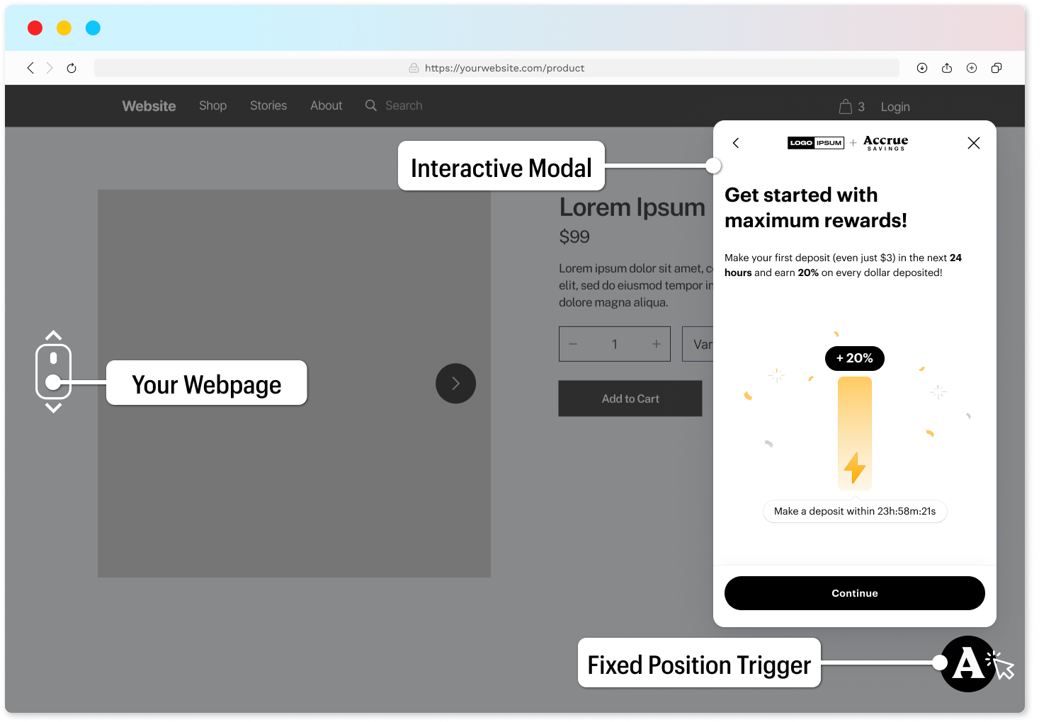
Default Trigger Component
The web SDK configures a fixed position bubble in the bottom-right corner of the website as the default trigger. Clicking on the bubble will launch the wallet frontend experience.
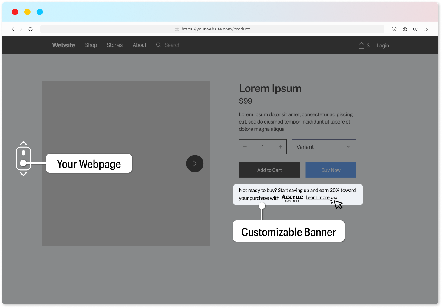
Banner Trigger Component
The web SDK supports a configurable banner html element that can be used to launch the wallet frontend and positioned at the merchant's prefered location on a webpage.
We cover customization of this component below
Catch Line
Use a catch-line that best reflects your own brand voice. It can include the reward values specific to your offering.
The catch-line copy text is not limited just to static text. We can use following dynamic values in any place:
| Placeholder | Explanation |
|---|---|
{rewards} | The minimal amount of rewards you are offering |
{merchantName} | Name of your company, website or shop |
{accrueLogo} | Full Accrue Savings logo |
{accrueLogoSymbol} | Condensed Accrue Savings logo |
{learnMore} | Learn More link |
{getStarted} | Get Started link |
Examples
Here are some sample banner triggers
{accrueLogo} Save up and earn {rewards} in cash rewards towards your purchase.
See how.

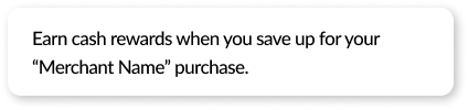
Earn cash rewards when you save up for your {merchantName} purchase.
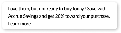
Love them, but not ready to buy today? Save with Accrue Savings and get
{rewards} toward your purchase. Learn more.
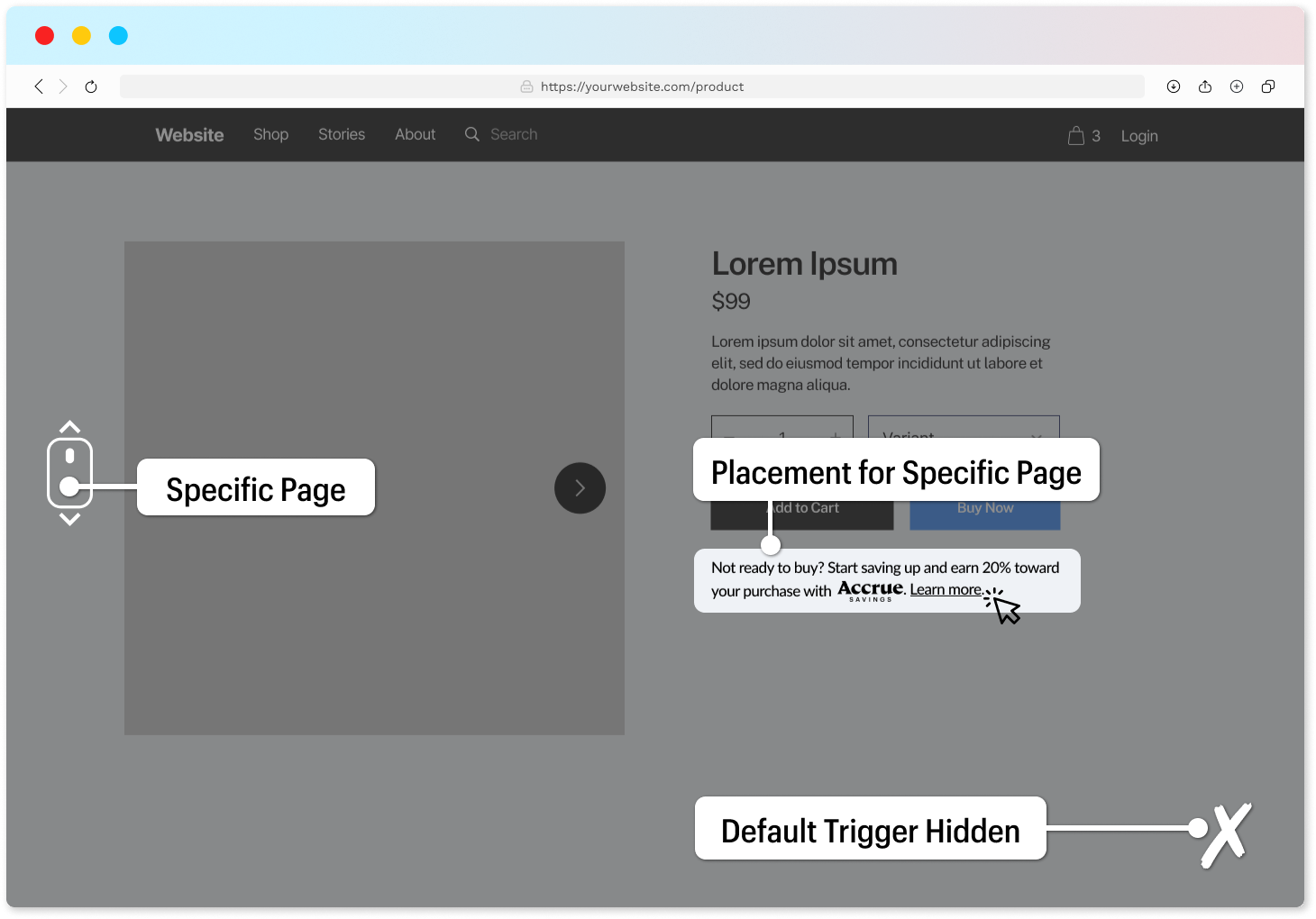
Placement
There are two different ways you can place the Accrue Savings banner using a Custom HTML tag and CSS selector.
Custom HTML tag
The web SDK defines a custom HTML element accrue-savings-placement that can be used in your markup to place the banner.
<accrue-savings-placement></accrue-savings-placement>
CSS selector
The web SDK uses CSS selectors for identifying banner placement. Apply the class attribute value of accrueSavingsPlacement on the element that you'd like to add the banner to.
<div class="accrueSavingsPlacement"></div>
Custom trigger
You can also choose to use your own trigger element, like a divider, link, button or image, instead of using the Fixed trigger, or the Banner. We will use the CSS selector referring to your custom elements to attach listeners that will open the modal.
<div class="accrueSavingsTrigger">Start Saving with Accrue Savings</div>
<a href="#" class="accrueSavingsTrigger">Start Saving</a>
<img src="./image.jpg" alt="Accrue Savings" class="accrueSavingsTrigger" />
Display rules
Once you have determined placement for the trigger component, you may want to hide it in certain instances.
The web SDK supports the following rules to explicitly hide or show the trigger component:
- Current URL - We can hide or show the trigger depending on what page the user is. Either an exact match or pattern matching.
- Content on the current page - We can hide or show the trigger in case certain HTML elements are present on the current page.
Placement override
Based on display rules we can also modify the trigger placement for specific pages.
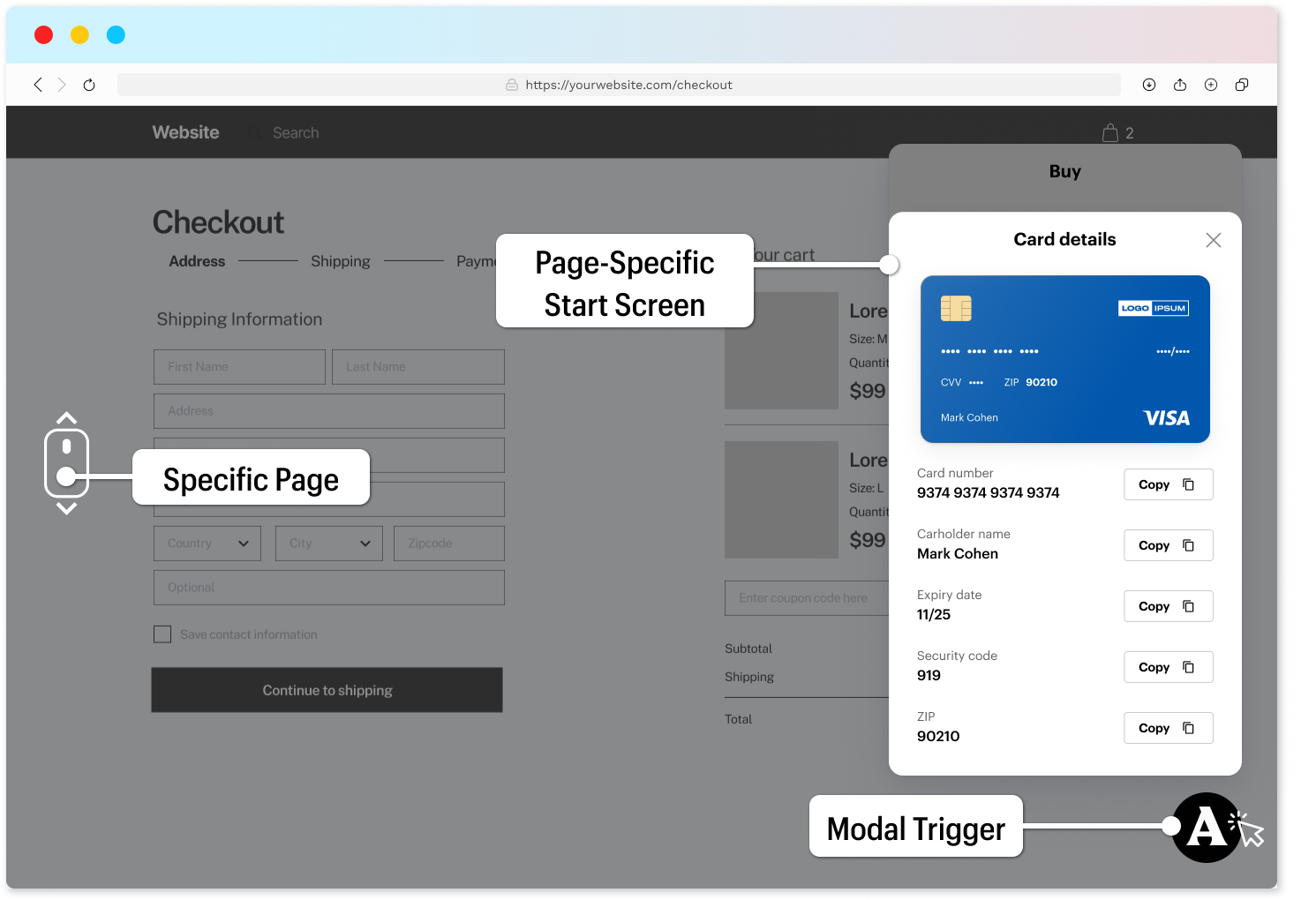
Deep linking
By utilizing display rules, we can configure the wallet frontend to display the buy panel at checkout instead of the default panel. The Web SDK support other deep linking opportunities, please consult Accrue for additional direction.