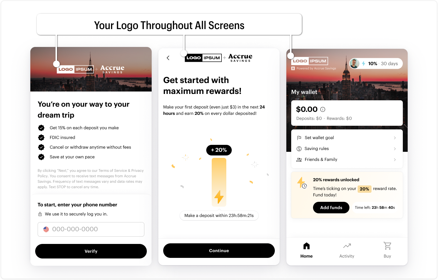
User Interface customization
The wallet frontend UI can be customized to match your brand aesthetics. We support customization of content and styles. Accrue provides white glove support and assistance to merchant design, marketing and branding teams to deliver a experience that your customers are familiar with.
Brand Logo
Your brand logo will be presented throughout the wallet frontend. Recommended dimensions are 90x30px. Great logos can be resized and quickly produced across hundreds of different contexts. Having different logo variations is essential for your business. Having easy-to-resize PNG and vector logo files will help you adapt them accordingly.
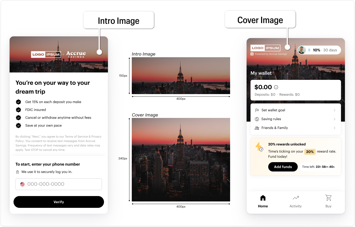
Images
The wallet frontend uses two banner style images.
- Intro - The intro image with dimensions
400x150pxis presented to the customer during onboarding - Cover - The cover image with dimension
400x340pxis presented to the customer during their savings journey and is the most often used image.
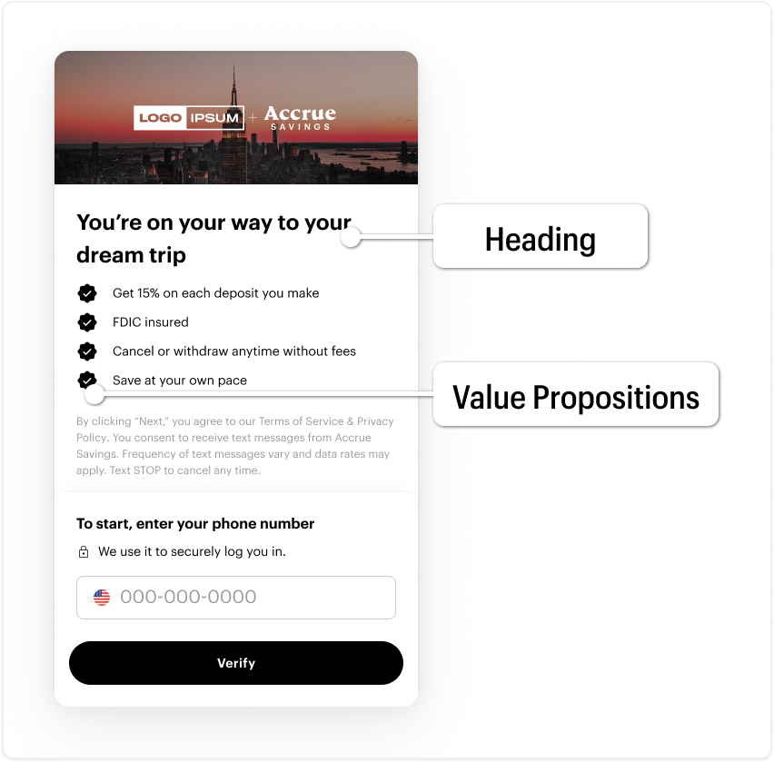
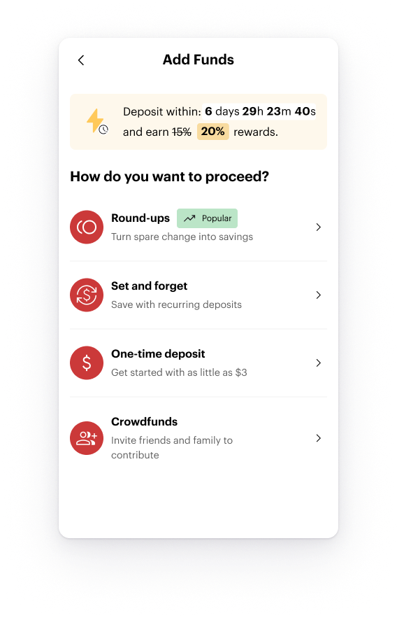
Value Propositions
The wallet frontend onboarding experience presents a value proposition screen. Content on this screen can be fully customizable to deliver messaging consistent with your values and offer.
The onboarding screen provide ability to customize content for a
- Heading - Deliver a brand message and call to action that reflects your values.
- Value Proposition - Detail the savings opportunity in language your customers recognize as coming from you.
Styles
The wallet frontend uses few and basic UI components to deliver the entire experience. We provide the ability to configure the color scheme and styles.
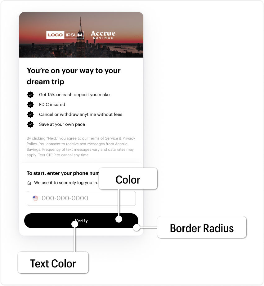
CTA Styles
Background color, text color and border can be customized on CTA's. Below we demonstrate a few examples.
Examples
{
    ctaColor: '#000000',
    ctaTextColor: '#ffffff',
    ctaBorderRadius: '50px'
}

{
    ctaColor: '#0133A0',
    ctaTextColor: '#ffffff',
    ctaBorderRadius: '14px'
}

{
    ctaColor: '#5DBEA3',
    ctaTextColor: '#000000',
    ctaBorderRadius: '0px'
}

Colors
Icons
Some icon can have their color customized. Below are a few examples.
{
    iconColor: '#CB3939'
}
{
    iconColor: '#1C1178'
}
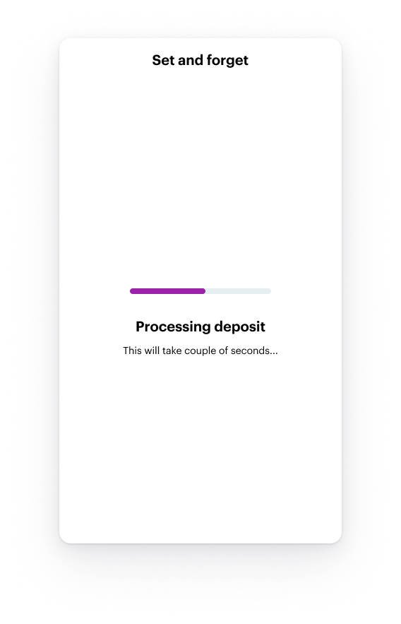
Loading Bar
Some screens have a loading bar, which color can be customized. Below are a few examples.
{
    loadingBarColor: "#36DD2D";
}
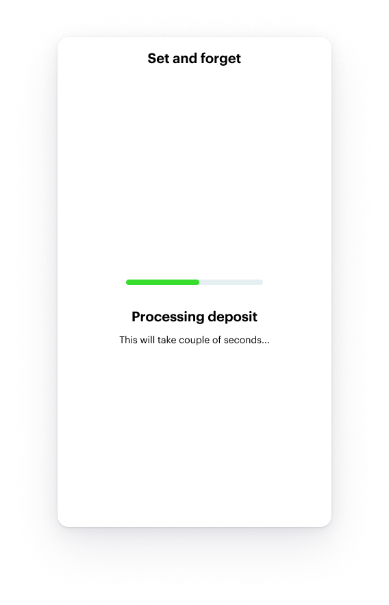
{
    loadingBarColor: "#9B23AB";
}
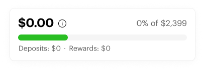
Savings Goal Progress Bar
The savings goal progress bar color can be customized. Below are a few examples.
{
    progressBarColor: "#CB3939";
}
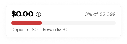
{
    progressBarColor: "#29BE23";
}
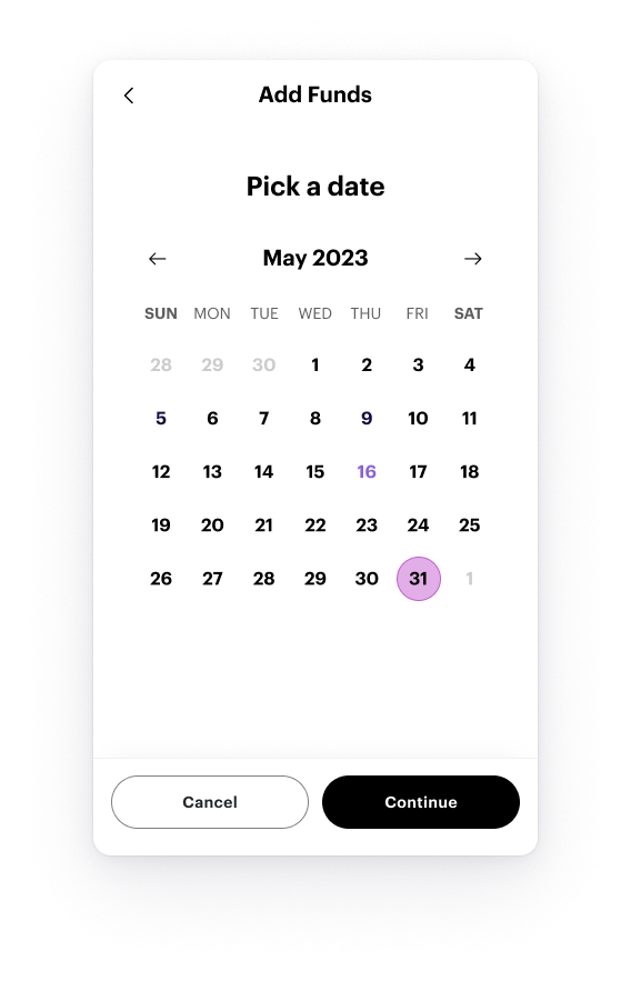
Date Selector
The date selector color can be customized. Below are a few examples.
{
    dateSelectorColor: "#69DBBD";
}
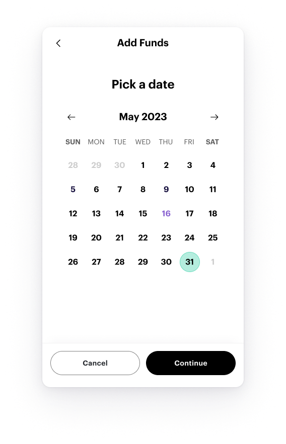
{
    dateSelectorColor: "#C25ECF";
}
Input Styles
Input styles and these are customizable. Below are a few examples.
Examples
{
    inputBorderRadius: "8px";
}

{
    inputBorderRadius: "0px";
}

{
    inputBorderRadius: "100px";
}
